Riverbend Brewing Company
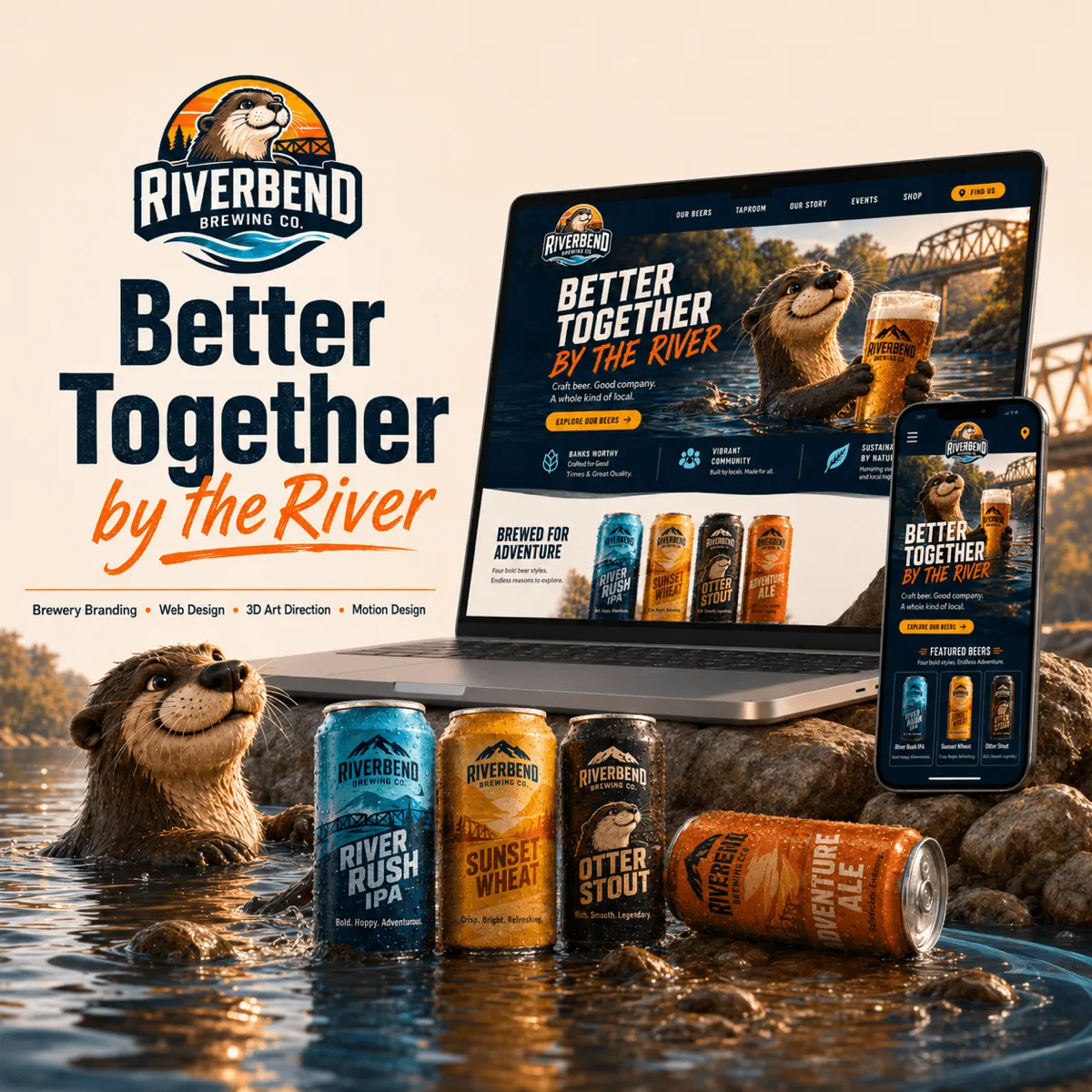
Better Together by the River
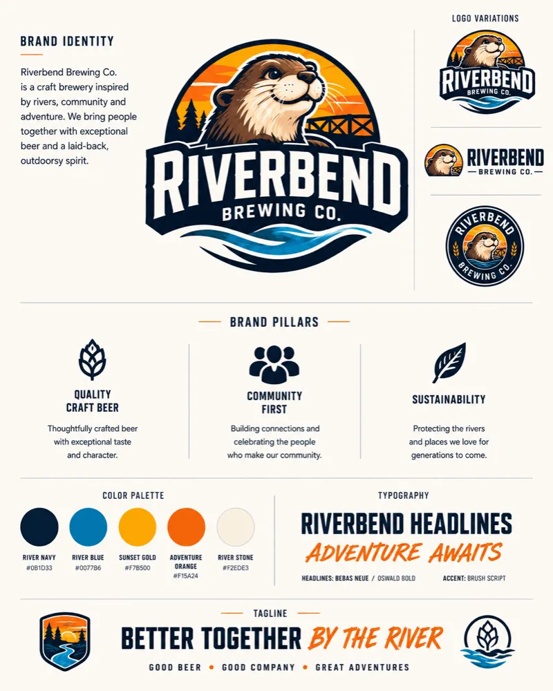
Riverbend Brewing Company is a fictional craft brewery inspired by riverside communities, outdoor adventure, and the simple experience of sharing a great beer with good company.
The project combines a playful otter-led identity with a premium digital experience designed to feel welcoming, energetic, and distinctly local. The brand system extends across the brewery website, mobile interface, beer packaging, social content, environmental graphics, and animated touchpoints.
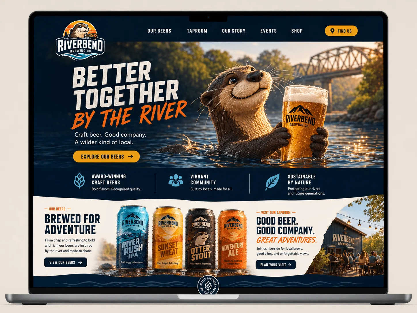
Rich 3D imagery, bold typography, and cinematic lighting bring the brewery’s world to life, while a structured user experience makes it easy to explore the beer collection, discover upcoming events, and plan a visit to the taproom.
Customer
Riverbend Brewing Company
Services
Brand
Logo Design
UI/UX Design
Mobile Experience
3D Product Visualization
Packaging
Animated Social Templates
Logo Animation
Digital Campaign Design
Designing the Concept

The process
Goals
The primary goal was to build a recognizable brewery brand that could stand out within a highly competitive craft beer market.
The identity needed to communicate quality without feeling overly serious, appeal to both craft beer enthusiasts and casual visitors, and establish an emotional connection through character-driven storytelling.
The digital experience also needed to encourage users to explore available beers, visit the taproom, discover local events, and interact with the brand across multiple platforms.
Challenges
The largest challenge was balancing the expressive otter character with a polished visual system that still felt credible as a premium brewery brand.
The website needed to deliver immersive 3D imagery and motion without sacrificing usability, navigation clarity, or mobile performance.
Another challenge was creating a flexible identity that could support many beer varieties, seasonal releases, event promotions, and social campaigns while remaining visually consistent.
Approach
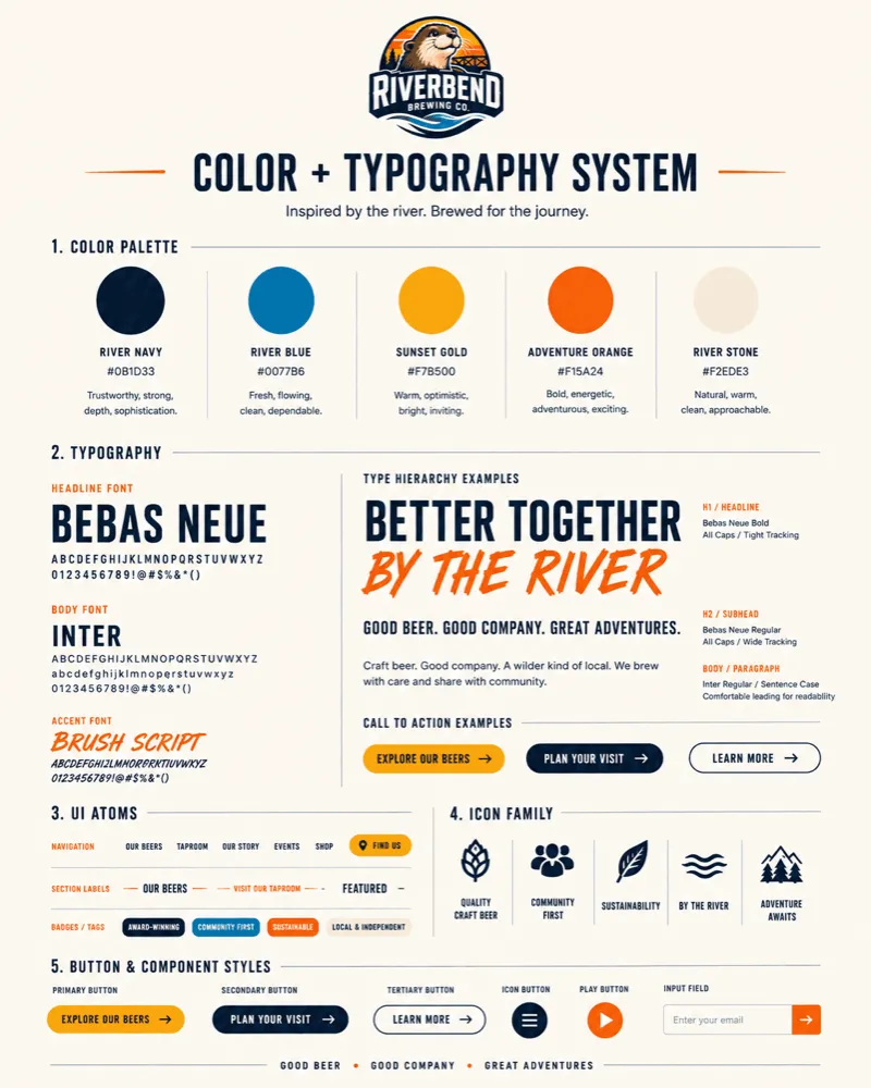
The concept began with the river as the central organizing idea. Flowing shapes, water-inspired patterns, sunset colors, bridge imagery, and natural textures were developed into a cohesive visual language.
The otter became the personality of the brand, introducing warmth, humor, and a memorable storytelling element. It was paired with strong condensed typography and structured layouts to keep the system bold and commercially credible.
The website uses a clear hierarchy built around three primary actions: explore the beers, visit the taproom, and connect with the community. Desktop layouts use wide cinematic imagery and layered 3D scenes, while the mobile experience simplifies navigation into thumb-friendly controls, stacked content sections, and a persistent bottom menu.
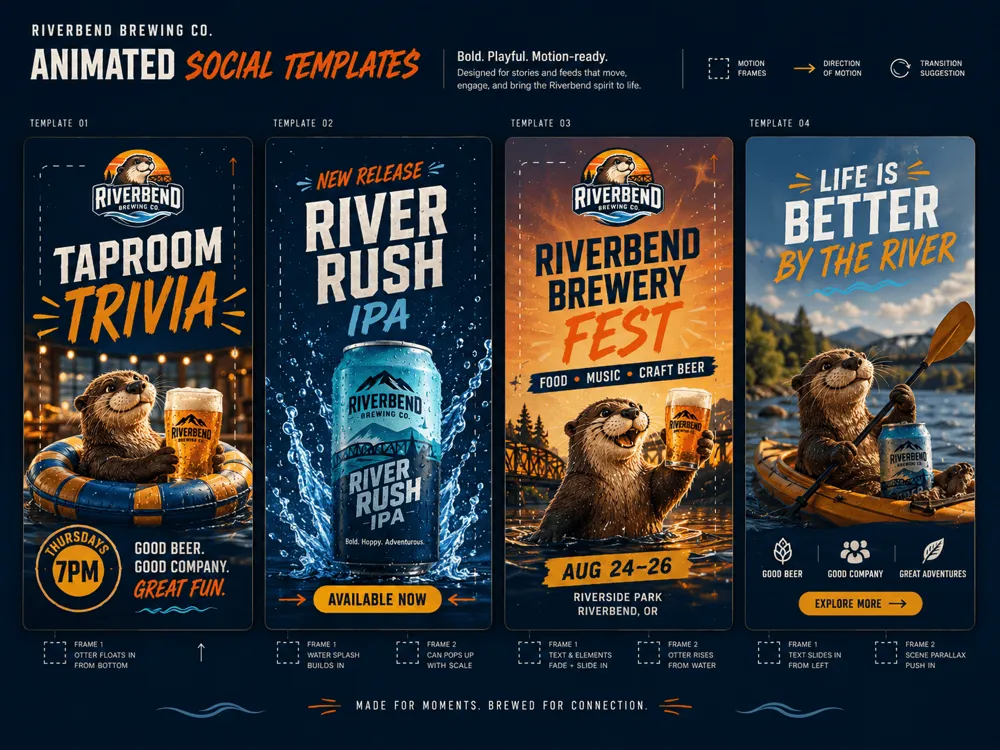
Motion was designed as part of the identity rather than an added effect. The animated logo reveal begins with a flowing river current that rises into the shape of an otter before resolving into the complete Riverbend badge. Social templates use water splashes, sliding typography, parallax imagery, and animated character moments to promote beer releases, events, and taproom programming.
The final system creates an immersive brewery world that feels adventurous, approachable, and built for connection.

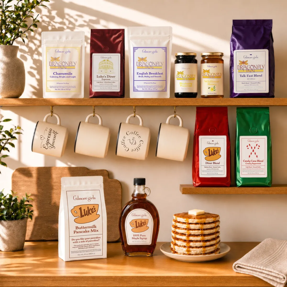
Gilmore Girls Collection
A Taste of Stars Hollow
Packaging
Products
Layout
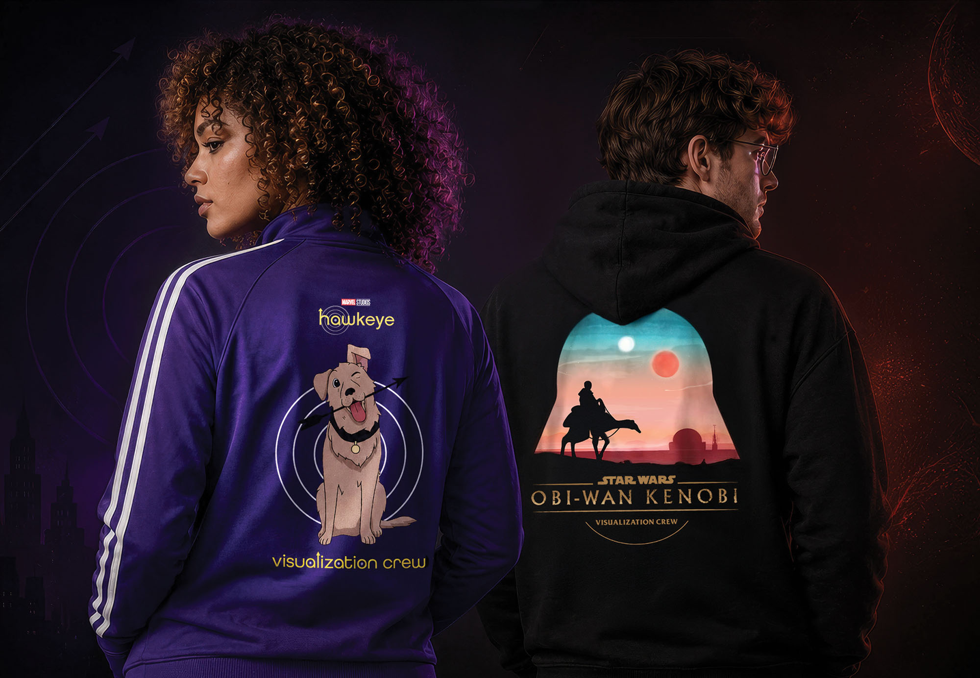
Studio Production Apparel
The Apparel is Strong with This One
Apparel
Illustration
Layout
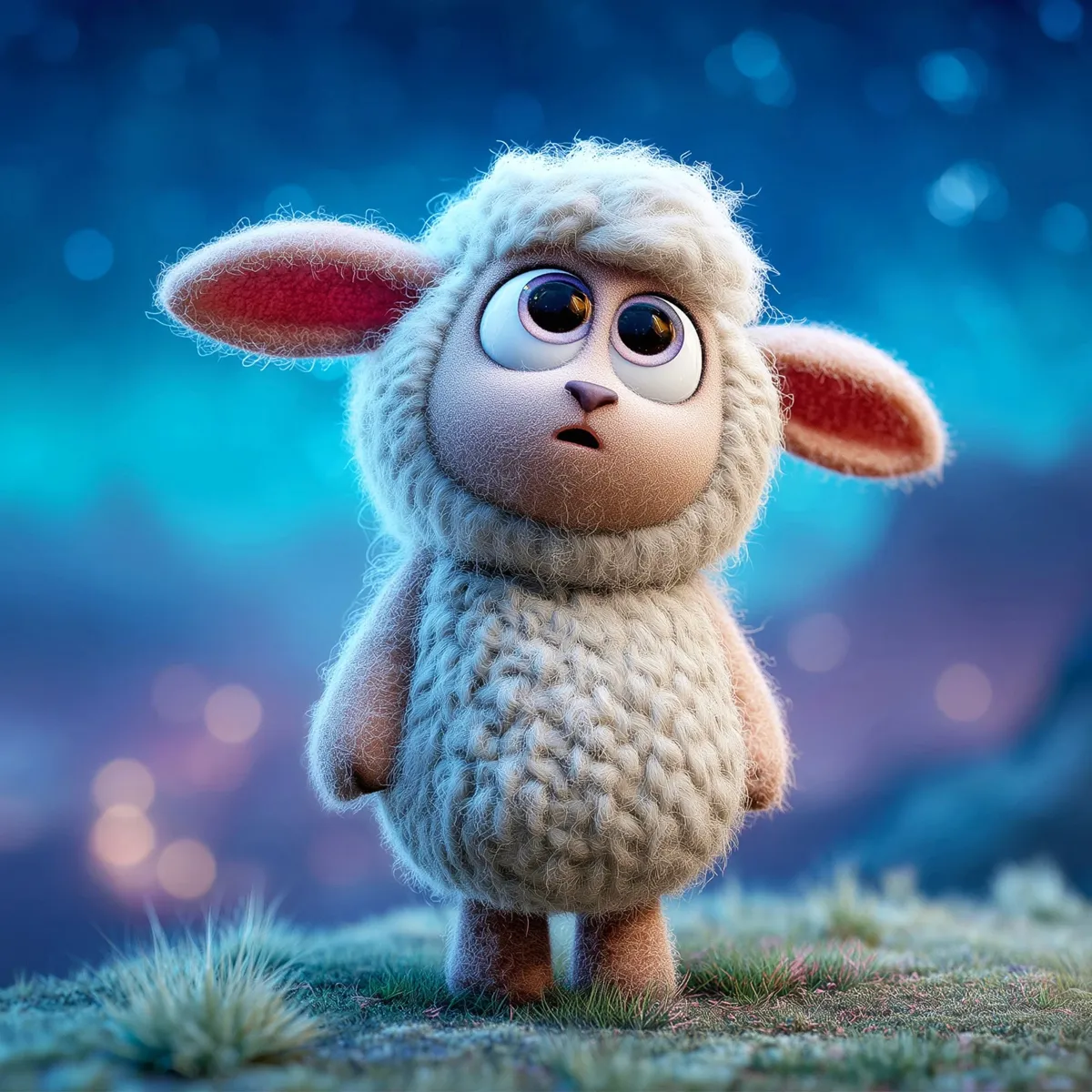
Lumi and Lantern Lane
Welcome to Lantern Lane
Branding
Vis Dev
Promotional
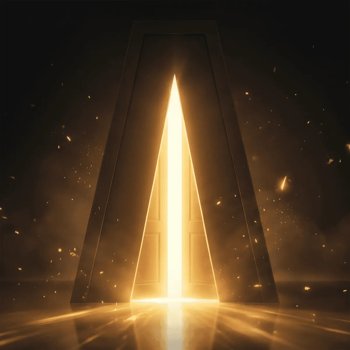
Lightframe Animation Studios
Bringing Worlds to Light
Branding
Web
Logo
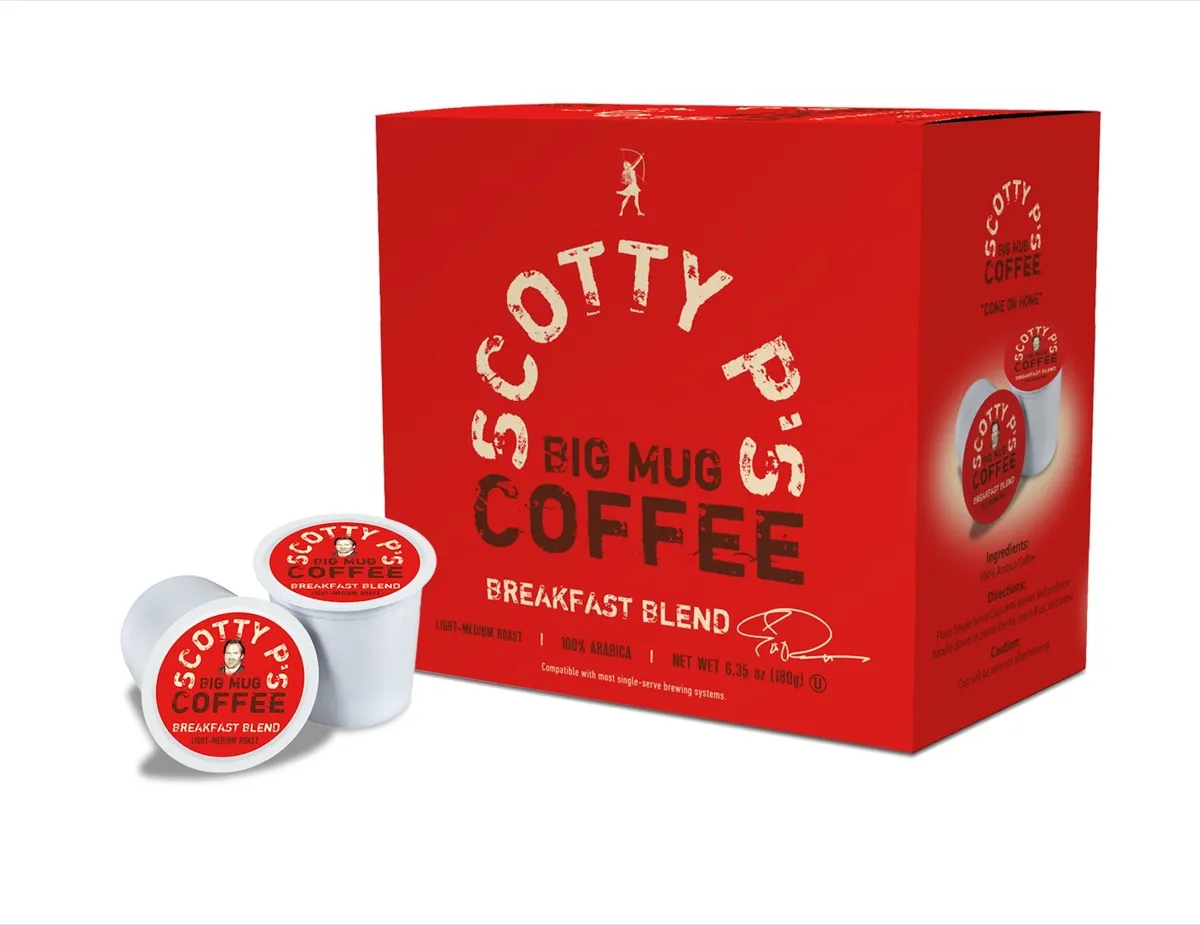
Scotty P's Big Mug Coffee
Come On Home
Branding
Packaging
Promotional
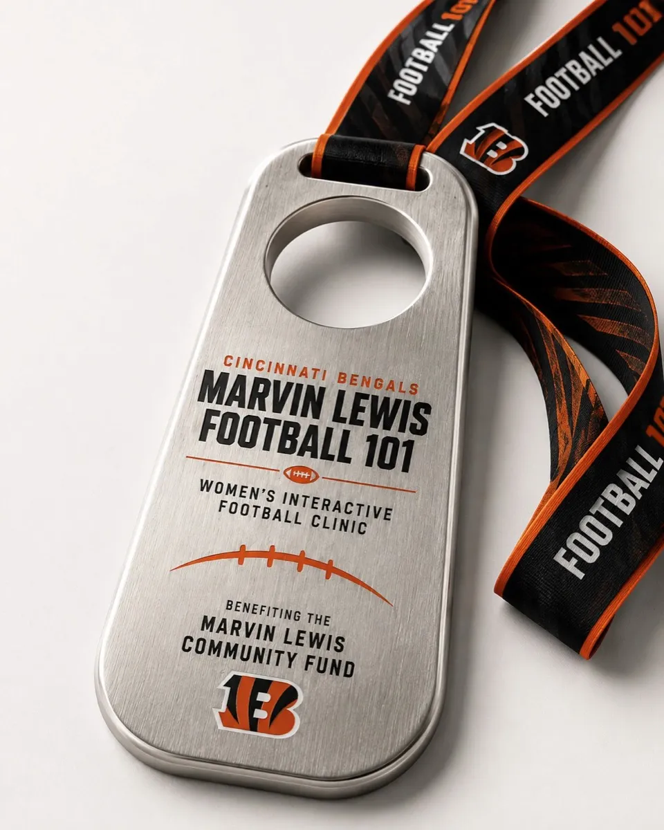
Marvin Lewis Football 101
Inside the Playbook
Event Branding
Award Design
Apparel
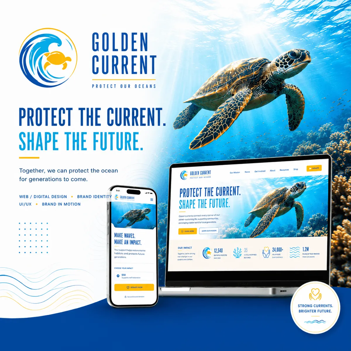
Golden Current
Protect the Current. Shape the Future.
Branding
Logo Design
UI/UX Design
Riverbend Brewing Company
Better Together by the River
Branding
Web Design
3D Art