Scotty P's Big Mug Coffee
Come On Home
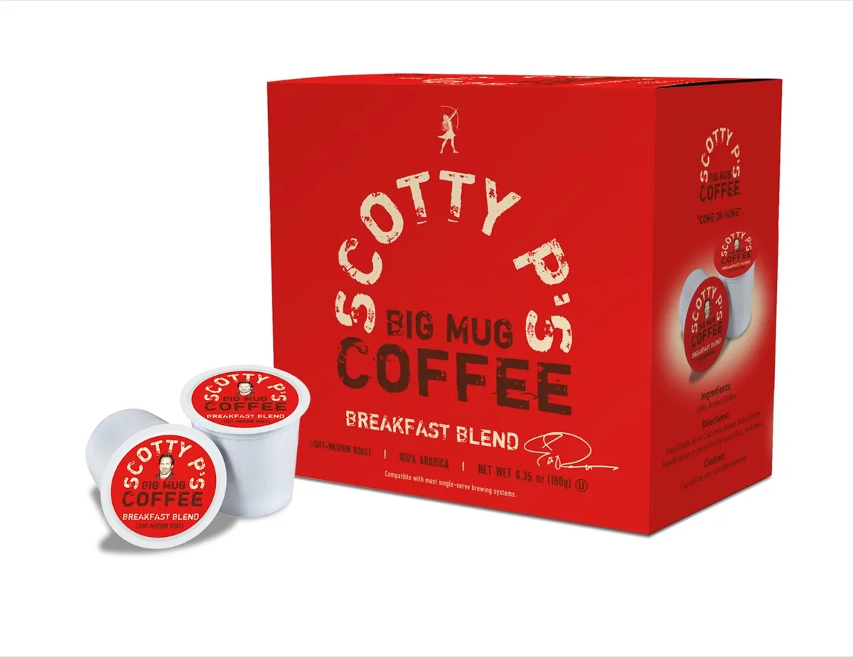
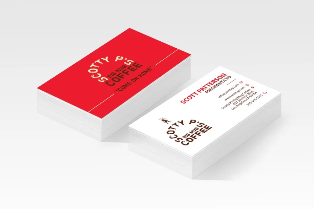
Scotty P’s Big Mug Coffee is a personality driven coffee brand created for actor Scott Patterson. The visual identity was built to feel bold, recognizable, and full of character while still working as a credible retail coffee brand.
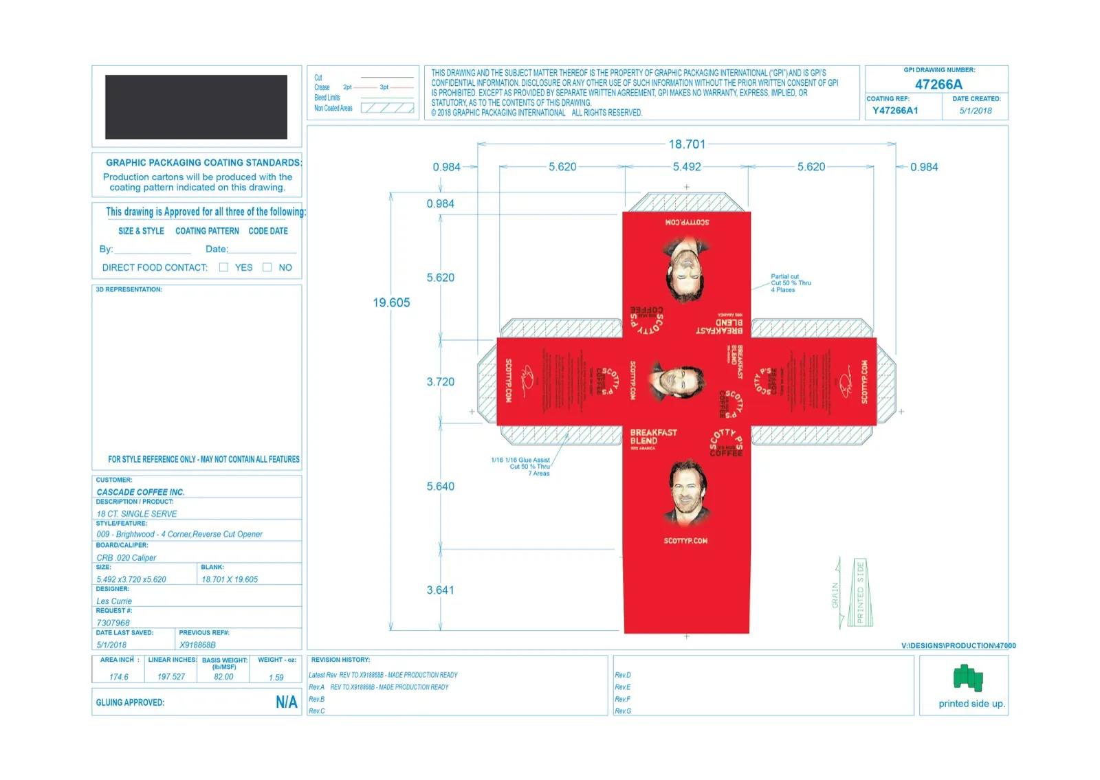
I designed the brand system across ground coffee bags, single-serve cups, retail boxes, flavor extensions, and promotional materials. The final identity uses a signature red palette, distressed typography, bold product hierarchy, and playful flavor graphics to create packaging with strong shelf presence and instant brand recognition.
Customer
Scott Patterson
Services
Brand identity
Packaging design
Promotional design
Product graphics
Retail packaging
Campaign materials
Website
Designing the Collection




The process
Goals
Create a bold, memorable coffee brand with strong shelf impact.
Build a flexible visual system that could work across bags, single-serve cups, retail boxes, and promotional materials.
Capture Scott Patterson’s personality and connection to his audience while keeping the brand polished and retail-ready.
Design packaging that would read clearly both in person and on camera.
Create a system that could support multiple roast types, flavor extensions, and promotional campaigns.
Challenges
The biggest challenge was balancing personality with credibility. The brand needed to feel fun and connected to Scott Patterson’s public persona, but it also needed to function as a real coffee product with clear hierarchy, roast information, and retail appeal.
Another challenge was maintaining consistency across very different packaging formats. Coffee bags, single-serve cups, and retail boxes all have different proportions, viewing distances, and information needs, so the identity had to stay recognizable while adapting to each format.
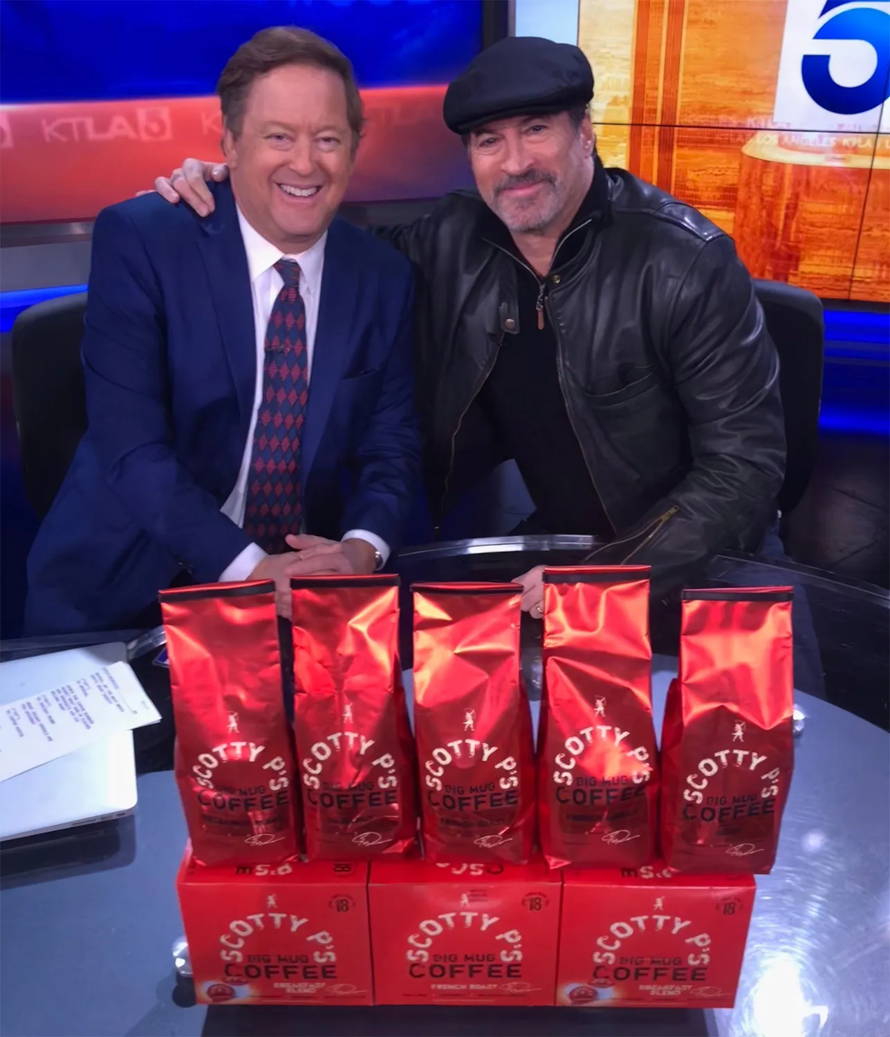
The packaging also needed to perform well in promotional settings. Since the products appeared in ads and live TV appearances, the design had to be bold enough to read quickly on camera and hold up in busy media environments.
Approach
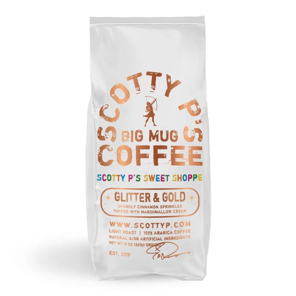
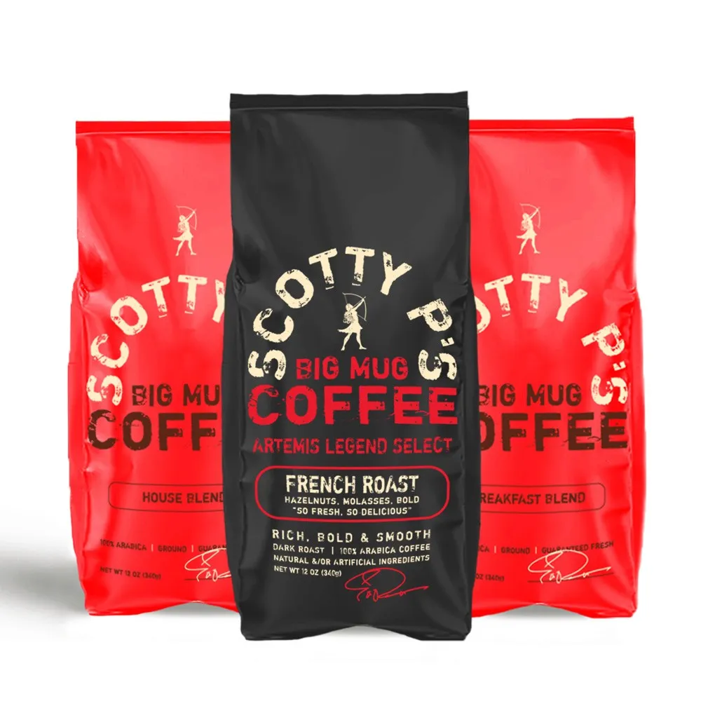
I built the identity around a strong red-led palette, distressed typography, and a bold front-of-pack layout that could be recognized quickly. The curved Scotty P’s lettering, archer mark, oversized coffee typography, and simple roast bands created a flexible system that could be repeated across product formats.
For the packaging extensions, I kept the core brand structure consistent while allowing each flavor to have its own personality. The red French Roast bag stayed clean and iconic, while specialty flavors like Glitter & Gold and Mom’s Favorite introduced more playful color, illustration, and graphic detail.
For promotional materials, I focused on product-forward layouts, bold headlines, and strong brand repetition. The goal was to make every touchpoint feel connected, whether it appeared on packaging, in an ad, on social media, or during a live TV segment.
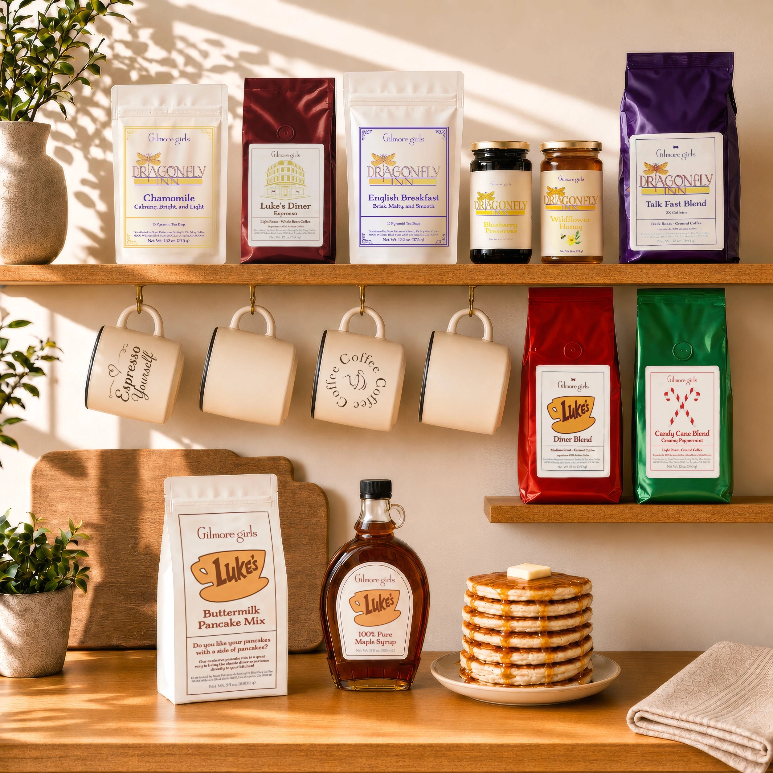
Gilmore Girls Collection
A Taste of Stars Hollow
Packaging
Products
Layout
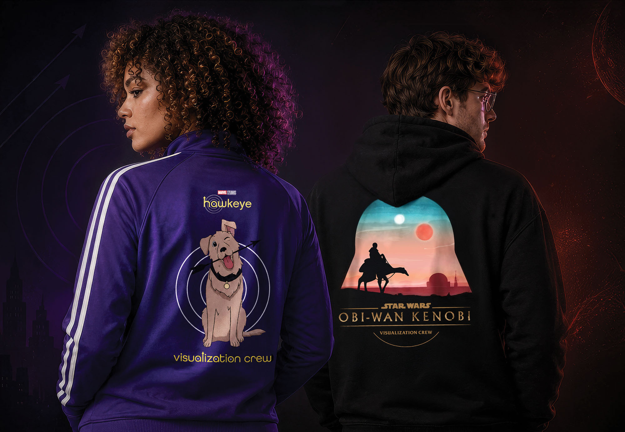
Studio Production Apparel
The Apparel is Strong with This One
Apparel
Illustration
Layout

Ernie Ball Music Man
Top Pick, Perfectly Tuned
Award Design
Product Design
Client Pitch
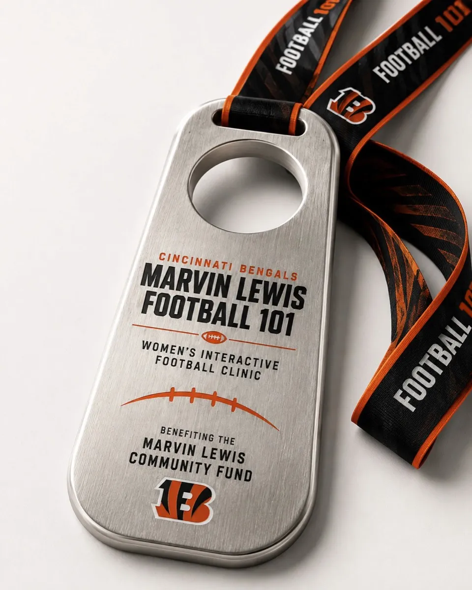
Marvin Lewis Football 101
Inside the Playbook
Event Branding
Award Design
Apparel
Scotty P's Big Mug Coffee
Come On Home
Branding
Packaging
Promotional

Lightframe Animation Studios
Bringing Worlds to Light
Branding
Web
Logo
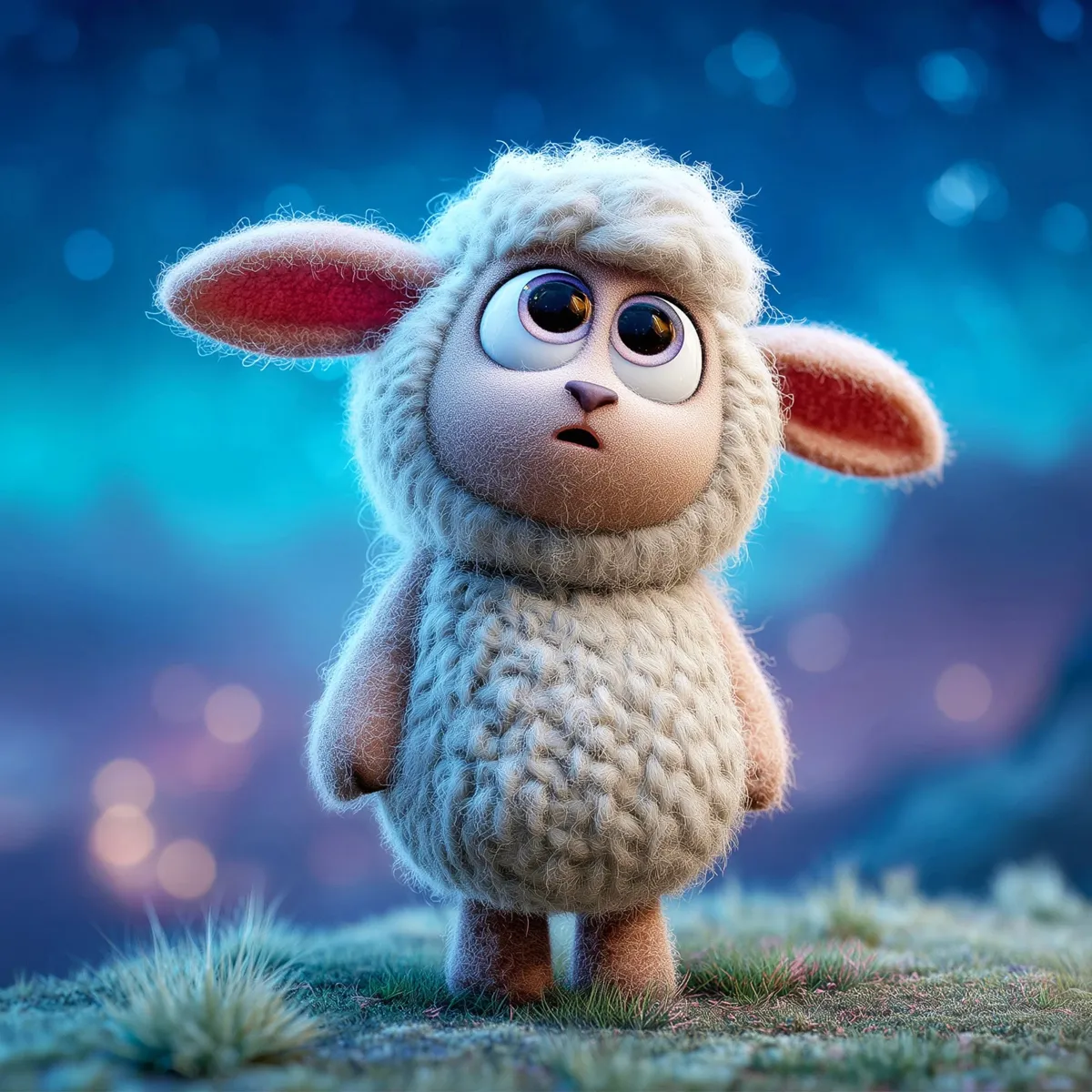
Lumi and Lantern Lane
Welcome to Lantern Lane
Branding
Vis Dev
Promotional
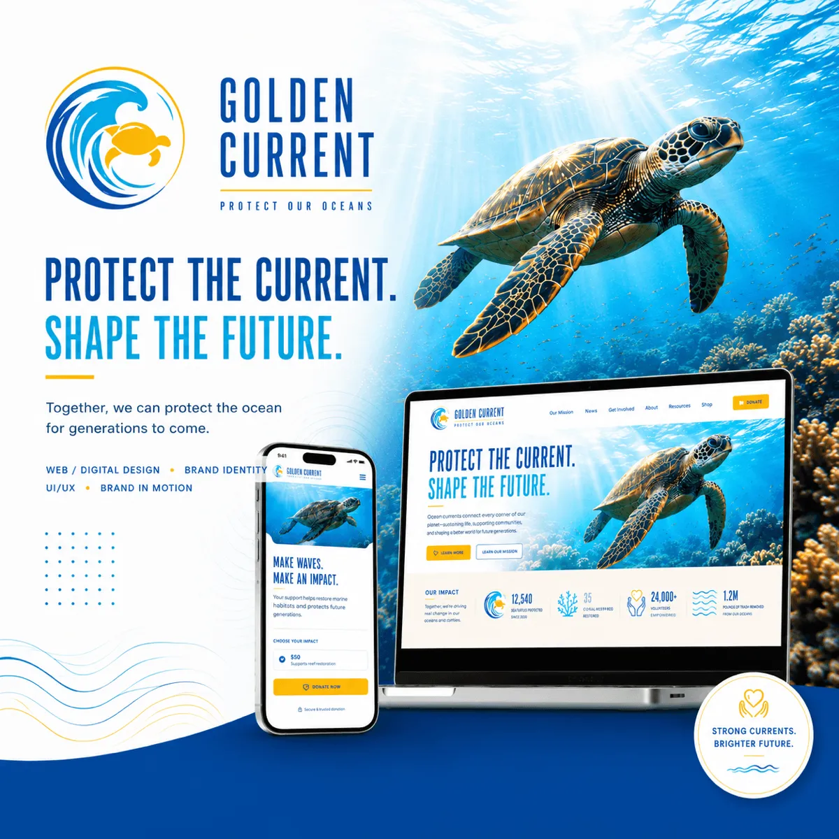
Golden Current
Protect the Current. Shape the Future.
Branding
Logo Design
UI/UX Design