Lumi and Lantern Lane
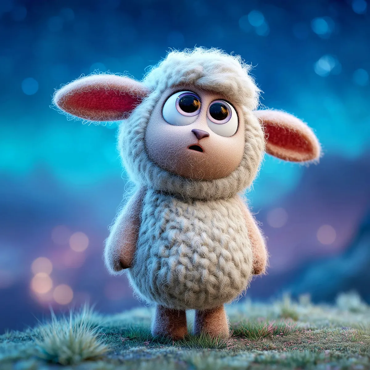
Welcome to Lantern Lane
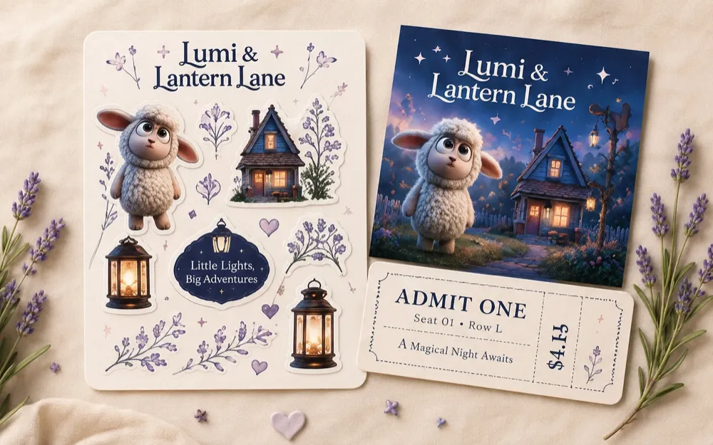
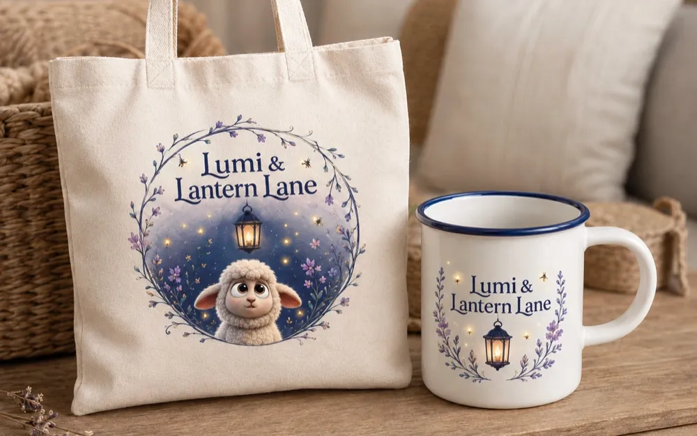
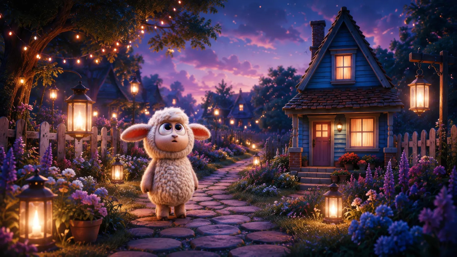
Lumi & Lantern Lane is a whimsical visual identity and campaign concept created for Bluebell Hollow Studio, a studio developing a cozy character-led story world. The project centers on Lumi, a curious little lamb, and a quiet cottage setting filled with soft light, gentle wonder, and storybook charm.
The goal was to build a design system that feels warm, cinematic, and emotionally inviting while still working across practical brand touchpoints like posters, merchandise, social content, website graphics, and promotional materials. The final direction combines expressive character imagery, soft environmental storytelling, elegant typography, and a dreamy moonlit color palette.
Customer
Bluebell Hollow Studio
Services
Branding
Visual Development
Art Direction
Merchandise
Print and Promotional Design
Designing Lumi's World
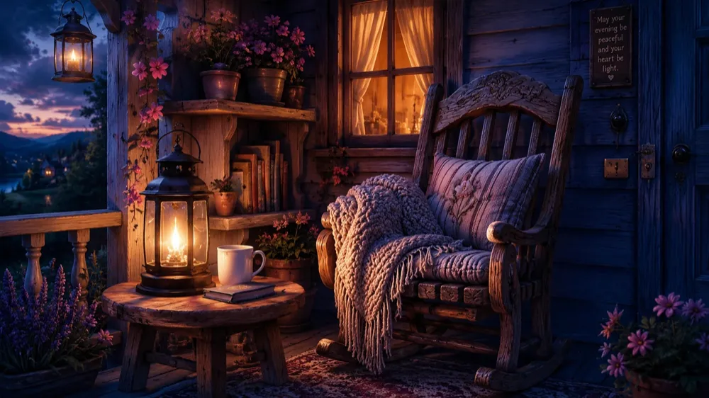
The process
Goals
Create a memorable visual identity for a story-driven animated property.
Build a brand system that feels warm, magical, and emotionally approachable.
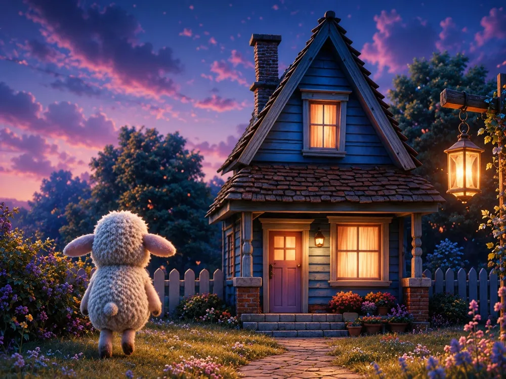
Connect the main character, Lumi, with the cottage environment in a way that feels cohesive and story-focused.
Design a flexible visual language that could work across digital, print, merchandise, and promotional applications.
Balance a premium storybook aesthetic with a playful character-led tone.
Make the project feel charming and cinematic without becoming too childish or overly decorative.
Challenges
The biggest challenge was balancing softness and sophistication. The character needed to feel cute and expressive, but the overall brand still had to feel polished enough for a professional animation property.
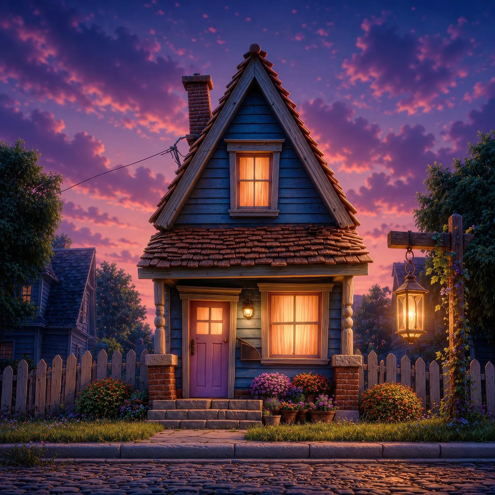
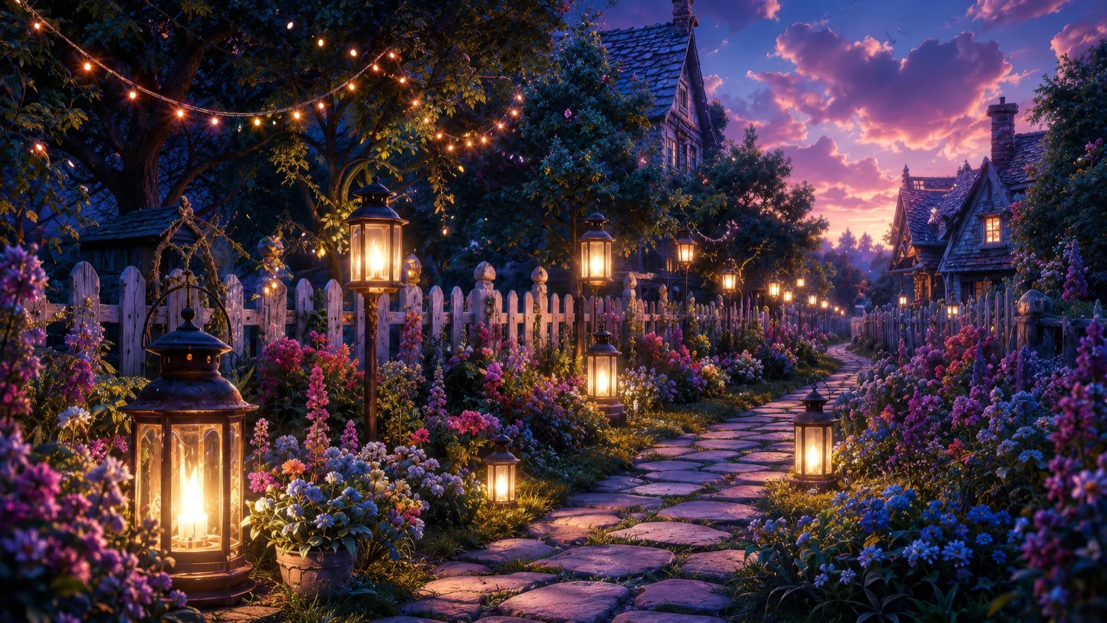
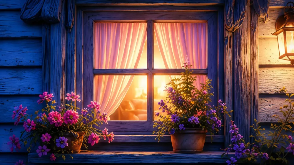
Another challenge was making the cottage, lanterns, flowers, and nighttime setting feel like part of the same world as the lamb character. The visuals needed to support the story rather than feel like separate decorative elements.
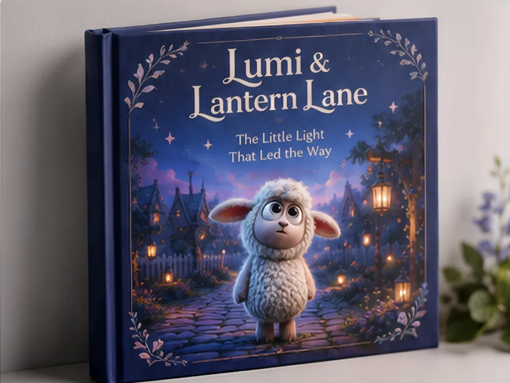
The identity also needed to scale across very different formats. A storybook cover, website hero, social post, sticker sheet, poster, and merchandise item all require different layouts, but they still needed to feel like they belonged to one cohesive brand system.
Approach
The visual direction started with the emotional tone of the story: quiet wonder, comfort, curiosity, and the feeling of finding your way home. From there, the design system was built around recurring visual motifs such as lantern light, bluebell florals, soft stars, cottage textures, and rounded frame shapes.
The color palette was developed around deep moonlit navy, twilight blue, lavender mist, lantern pink, warm peach, and soft cream. These colors helped create a dreamy nighttime atmosphere while keeping the brand gentle and approachable.
Typography was chosen to reinforce the storybook quality of the project. An elegant serif display style gives the identity a classic, literary feel, while simpler supporting type keeps the system usable across modern digital and campaign materials.
The final applications show how the identity could expand into a full launch package, including key art, poster design, social graphics, website concepts, merchandise, stickers, and print pieces. Each touchpoint uses the same core visual language while allowing enough flexibility for different storytelling moments.
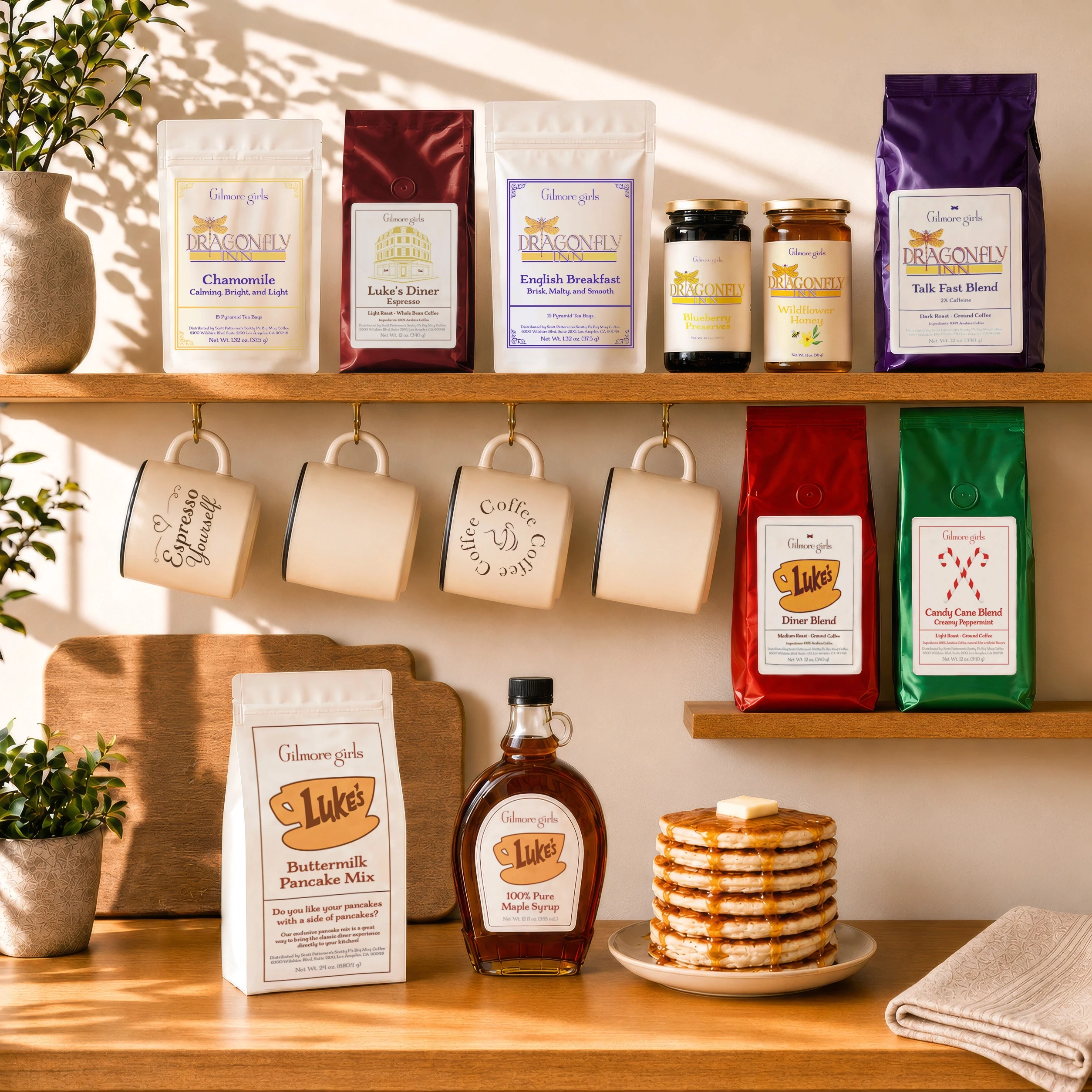
Gilmore Girls Collection
A Taste of Stars Hollow
Packaging
Products
Layout
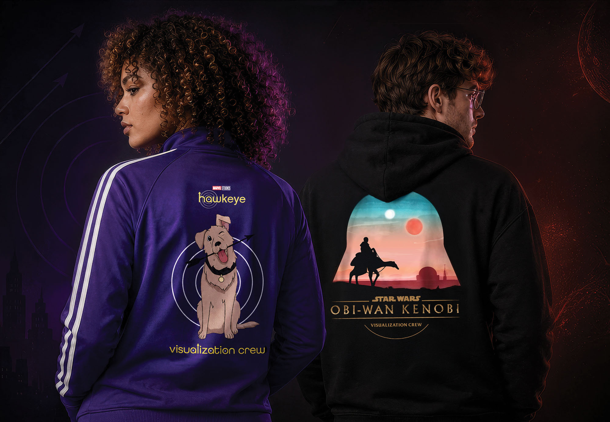
Studio Production Apparel
The Apparel is Strong with This One
Apparel
Illustration
Layout

Ernie Ball Music Man
Top Pick, Perfectly Tuned
Award Design
Product Design
Client Pitch
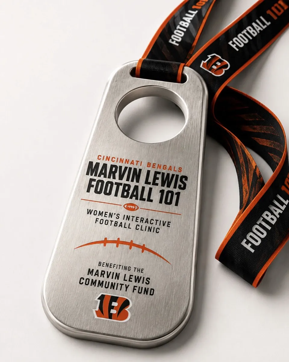
Marvin Lewis Football 101
Inside the Playbook
Event Branding
Award Design
Apparel
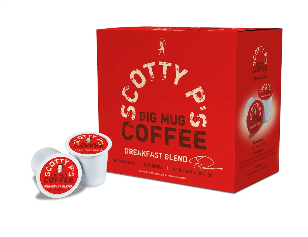
Scotty P's Big Mug Coffee
Come On Home
Branding
Packaging
Promotional
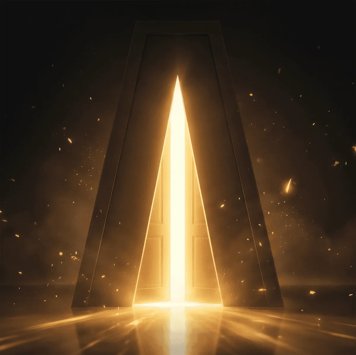
Lightframe Animation Studios
Bringing Worlds to Light
Branding
Web
Logo
Lumi and Lantern Lane
Welcome to Lantern Lane
Branding
Vis Dev
Promotional
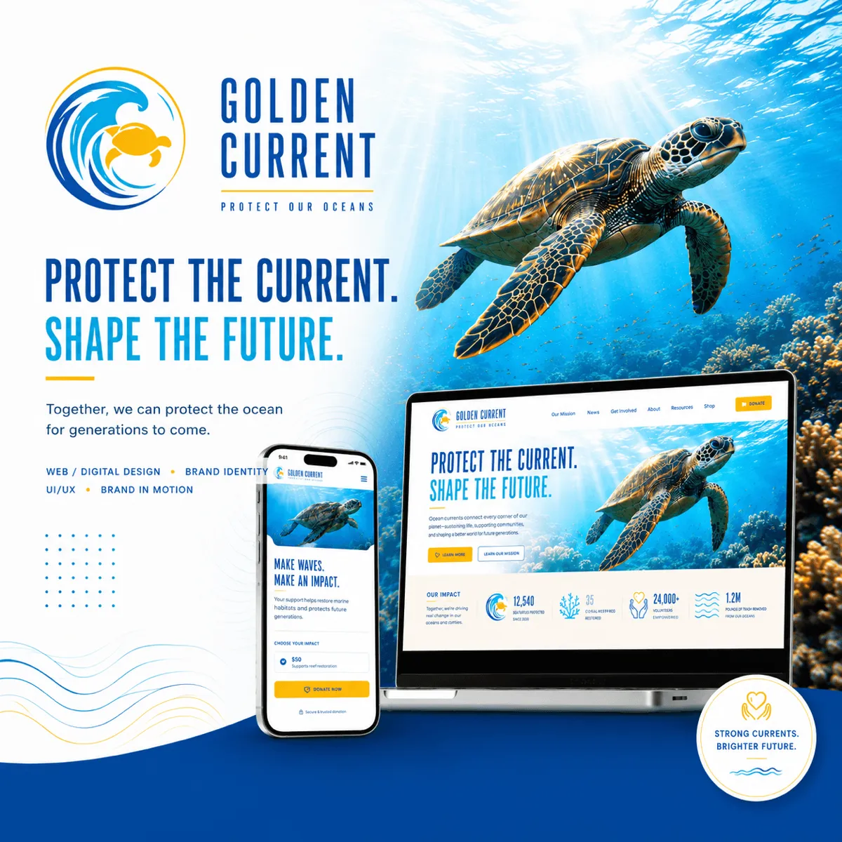
Golden Current
Protect the Current. Shape the Future.
Branding
Logo Design
UI/UX Design